

Ensuring a seamless user experience on device screens of all shapes and sizes is important in an increasingly mobile-centric world.
This is where Responsive Web Design (RWD) steps in, by utilizing only HTML and CSS.
This article expounds on the complexities of a responsive web design.
In addition, this article aims to present the how-to of a responsive website clearly.
Knowledge of HTML basics and an idea of how CSS works is a prerequisite for understanding this article.
Table of contents
What is web responsiveness?

According to Wikipedia,
Responsive web design (RWD) or responsive design is an approach to web design that aims to make web pages render well on a variety of devices and window or screen sizes from minimum to maximum display size to ensure usability and satisfaction.
The responsiveness of a website means the Adjustable Layout of the site dependent on the screen size.
Responsive web design is not a program or a JavaScript framework. Responsive web design uses only HTML and CSS.
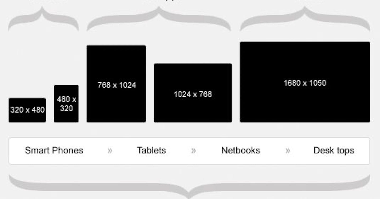
The need for web responsiveness

The challenge of creating websites that looked good on multiple screen sizes and devices gave rise to the need for web responsiveness.
Websites in the early days of the internet were created with a fixed, static layout that didn't change according to the size of the screen.

Facebook login page on mobile

Facebook login page on desktop
However, with the rapid increase in use of mobile devices, there was a greater demand for responsive design.
Websites must now be adapted for mobile devices as more people use smartphones and tablets to access the internet.
The term ‘responsive design’ was coined by Ethan Marcotte in 2010.
How to make a site responsive
Designing a responsive website requires an understanding of only HTML and CSS as earlier stated.
On account of the point above, the following are the methods to achieve responsiveness:
Using CSS
Using CSS frameworks
Using CSS
There are a lot of features built into CSS to make designing responsive sites easier. These are:
Media queries
Media queries allow you to write the same CSS code in different ways for multiple screens.
Using media queries, CSS is used depending on the screen resolution.
The following code snippet explains the layout of media queries:
     @media screen and (max-width: 768px) {

      /\*CSS codes go here\*/

      }
The code above instructs the browser to execute the CSS code written within the media query when the screen width is below a 768 pixel breakpoint.
Breakpoints are the points at which a media query is introduced and the layout changes.
Supposing that the screen resolution is above 768 pixel breakpoint, the code above wouldn’t run.
For example, the following media query tests to see if the current web page is being displayed on a screen width of at least 320 pixels wide.
The CSS for the .container selector will only be applied if the condition is true.
     @media screen and (min-width: 320px) {

      .container {

       margin: 1em 2em;

       }

       }
Multiple queries can be added within a CSS code.
The breakpoints can usually be any value between 1200 pixels and 320 pixels.
The MDN documentation for Media Queries has more information.
Multicol
If you use multicol, you can enter a column-count to specify the maximum number of columns into which your material should be divided.
The size of these is then determined by the browser and will vary based on the size of the screen.
     .container {

      column-count: 4;

      }

      .container {

       column-width: 100px;

       }
In the code snippet above, a column-width is used which means minimum width is specified.
The browser will make as many columns 100px wide as would comfortably fit in the container, then divide the remaining space among all the columns.
Therefore the number of columns will change according to how much space there is.
Using the columns shorthand to provide a maximum number of columns and a minimum column width ensures that :
line lengths don't become too long as the screen size increases
line lengths don't become too narrow as the screen size decreases.
Flexbox
Flexbox is used to lay out multiple elements, even when the size of the contents inside the container is unknown.
When a display of flex is assigned to the containing element, the element direction is rendered on the row by default.
Items in a flexbox shrink or grow. Below are some code examples:
     <div class="flex-container">

     <div class="flex-item">Item 1</div>

     <div class="flex-item">Item 2</div>

     <div class="flex-item">Item 3</div>

     </div>

     .flex-container {

     display: flex;

     justify-content: space-between;

     align-items: center;

     }

     .flex-item {

     flex: 1;

     padding: 10px;

     border: 1px solid #ccc;

     }
With the examples above, the three flex items will be evenly distributed with space between them, centered vertically, and automatically adjust their width to fit the container.
To get a more insight on flexbox, read CSS Tricks’ flexbox guide.
CSS grid
Using CSS grid, spaces are distributed across grid tracks using the fr unit.
The fr unit represents a small portion of the grid container's total area that can be used to dynamically size grid rows and columns.
     .container {

     display: grid;

     grid-template-columns: 2fr 2fr 2fr;

     }
The code above creates three column tracks, each taking one part of the available space in the container.
Using CSS frameworks
In addition to plain CSS, certain frameworks have utilities that aid creating responsive websites.
These frameworks offer efficient ways to achieve responsiveness without starting from scratch.
For the intent of this document’s scope, one framework will be treated:
- Bootstrap 5
Bootstrap 5

Bootstrap’s grid system uses a sequence of the following to layout and align content:
containers
rows
columns
Bootstrap’s grid system uses a 12 column system to create responsive layouts. Additionally, the Bootstrap grid system has four classes. The following table explains these classes:
Class | Screen width |
xs | 768px |
sm | Equal or greater than 768px |
md | Equal or greater than 992px |
lg | Equal or greater than 1200px |
The following steps provide the steps to creating responsive layouts:
Include Bootstrap 5 in your project: To begin:
Create a new HTML file
Include the Bootstrap 5 Content Delivery Network (CDN) links in the <head> section of your HTML file.
<link rel="stylesheet" href="https://cdn.jsdelivr.net/npm/bootstrap@5.3.1/dist/css/bootstrap.min.css">
Set Up a Container: Use the container class to create a fixed-width container or container-fluid class for a full-width container. For example:
```
3. **Define Rows and Columns:**

    1. Use the row class to create a row.

    2. Add columns inside it using the col class.

    3. Specify the column size based on the device using different classes. For example:
4. **Use Responsive Utilities:** Bootstrap provides responsive utility classes to control the visibility and spacing of elements based on screen sizes. You can use classes like:

    1. d-none

    2. d-sm-block

    3. d-md-none

    4. mt-lg-4, etc. to control the display and spacing. For example:
```
- Test and Adjust: Preview your layout on different devices and screen sizes to ensure it looks good and adapts appropriately. Adjust the column classes and responsive utility classes as needed to achieve the desired responsive behavior.
Other CSS frameworks that support responsive web design include the following:
Benefits of responsive web design
The bullet points below explain the benefits of incorporating responsive web design into your User Interface (UI):
More mobile traffic: Due to the mobile-centric approach of responsive web design, the volume of website visits and interactions originating from mobile device’s increases.
Lower maintenance needs: Additional testing and maintenance are needed to maintain a separate mobile website. In contrast, responsive web design ensures appropriate layout on every device. A distinct content strategy, multiple administration interfaces, and maybe two design teams are required when there are separate desktop and mobile sites. Consequently, responsive design’s “one size fits all” approach enables developers, customers and company owners have fewer hassles. By focusing less on maintenance, there’s more time for other tasks like marketing and content production.
Lower bounce rates: Bounce rate refers to the percentage of visitors who land on a website and leave without interacting with any other pages or elements on the site. A responsive and optimized mobile site provides a much better user experience for the visitor. Therefore, it is much more likely that they'll stick around for a longer period of time and explore different areas of your site.
Improved SEO: Having a single responsive website rather than separate desktop and mobile versions avoids the issue of duplicate content, which negatively impacts your search ranking. Additionally, Google has moved toward a “mobile-first” approach in recent years.
Improved User Experience: A responsive web design significantly impacts user experience by adapting the website's layout and content to different screen sizes and devices. This ensures a consistent and visually appealing experience for users, whether they access the site on desktops, tablets, or smartphones.
Enhanced Social sharing: Having a responsive website makes increaes users’ engagement with your site then sharing it on social media. More social traffic means more users visiting your site. In addition, a great social media presence can increase visibility for your website.
Conclusion
Responsive web design is no longer an optional consideration but a crucial aspect of modern web development.
By adopting a mobile-first approach and employing techniques discussed in this document, developers can create websites that deliver an optimal user experience across all devices.